
Google Certificate Program - UX Design
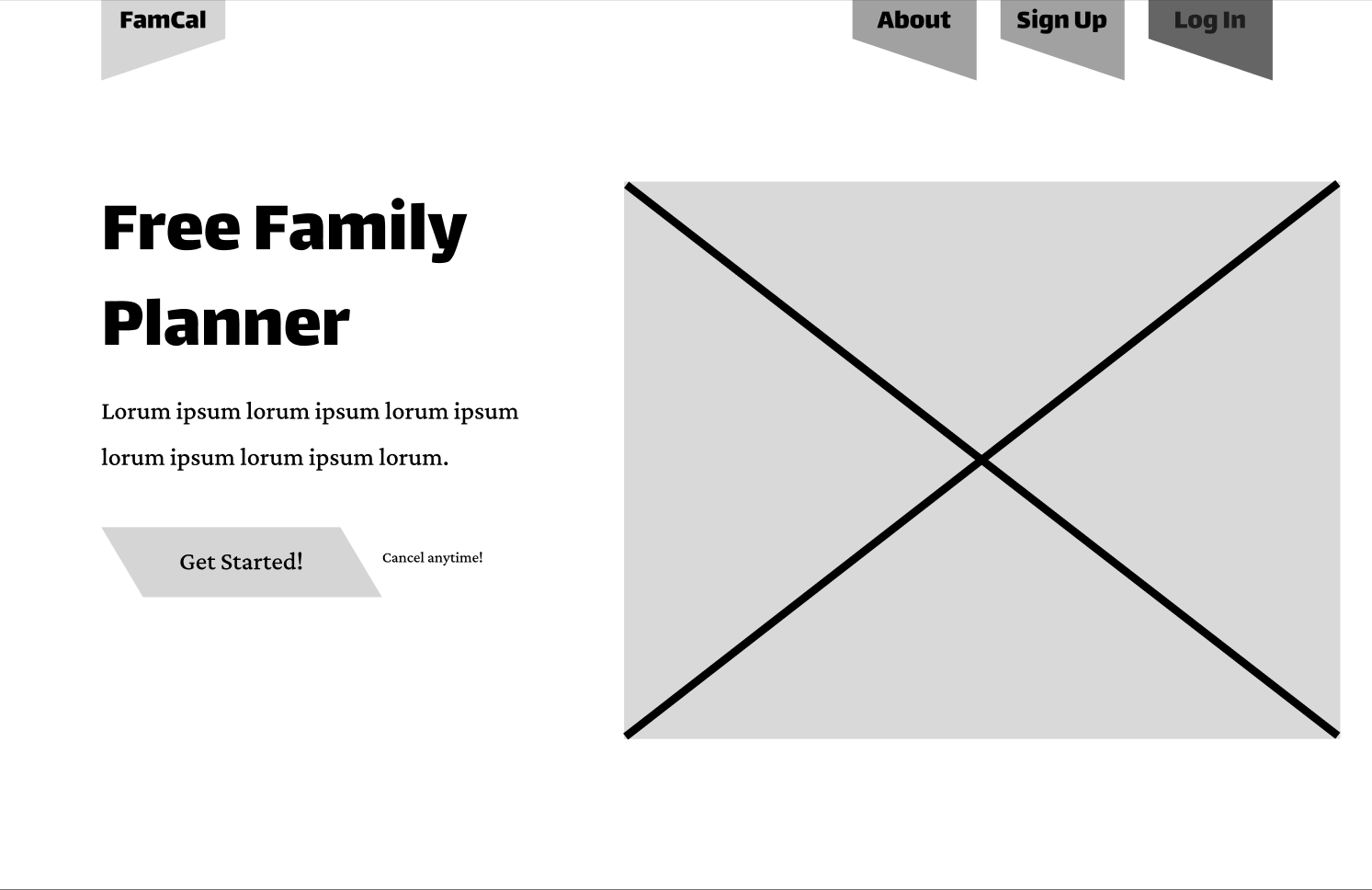
FamCal
See More
-
See More -
Personal Pain Points
I decided to design FamCal because I was tired of the constant "when are you free" texts from my parents. This manual coordination creates an annoying mental load for everyone involved. To see if I could fix it, I audited Google and Apple Calendar and found that while they are powerful, they feel like corporate spreadsheets. They lack the visual allure and customization that makes a younger user actually want to engage with a schedule and return to the app/site. I realized there was a major opportunity to build a tool that feels more like a shared family dashboard than a professional planner.
To keep the design grounded in real needs, I developed a persona named Rebecca Smith. As a busy parent, her main user story was simple: she needs a way to view her kids' changing schedules without having to constantly nag them for updates. This helped me focus on the "sync" aspect of the app rather than just the individual calendar.
My research and early testing proved that users were understandably so frustrated with the basic look of typical low-fidelity wireframes. During the first round of testing, the Key Performance Indicators focused on were Time on Task, User Error Rates, and Conversion Rates. Honing in on those KPI’s allowed me to better find insights to improve the design based off of real users input. Participants were vocal about wanting more color and better icons because the lack of direction caused constant navigation stumbles. I found that every single person I tested struggled to find the new event button on the low fidelity wireframes. These insights pushed me to create a bold and high-contrast interface where the most important actions are impossible to miss, even by younger users. I kept the family circle management simple since that was the one area where users felt confident. The final result focuses on making scheduling feel less like a chore and more like a synchronized family habit.


Sketching & Iterating - Web Version
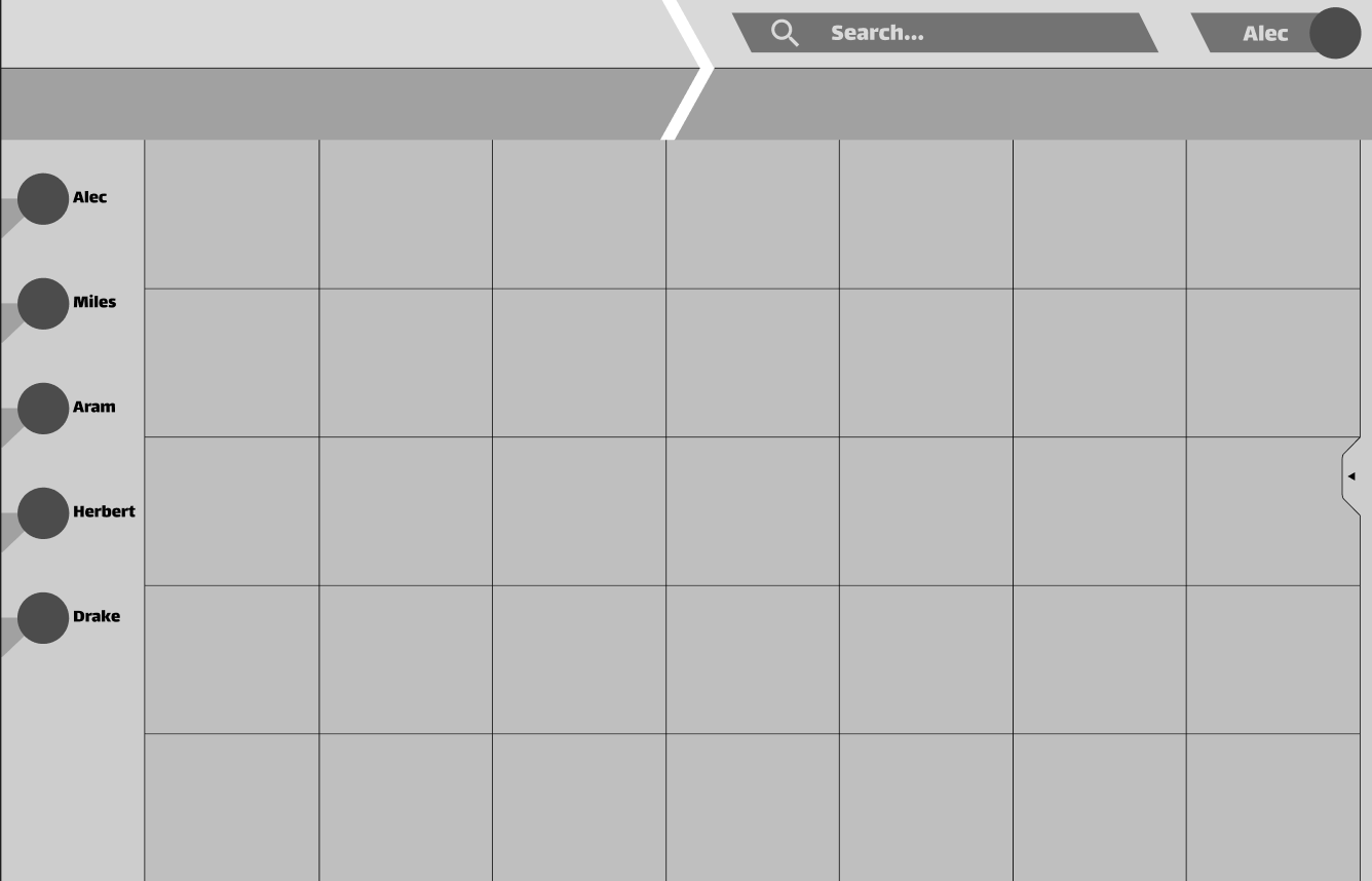
For the web version, I approached the sketching phase by focusing on how to use the extra screen real estate to make every action as efficient as possible. My initial sketches explored ways to keep the calendar somewhat visible at all times, even when checking the dashboard, so users never lose their sense of context. Once I moved into Figma for the low-fidelity wireframes, I prioritized a layout that felt open and balanced rather than crowded with menus. This iteration allowed me to test how a larger dashboard could house both the dashboard and the calendar system without overwhelming the user, ensuring the core navigation stayed consistent across the wider desktop format.
Early Iterations:


Low Fidelity to High Fidelity - Mobile Version
User Testing and Iteration
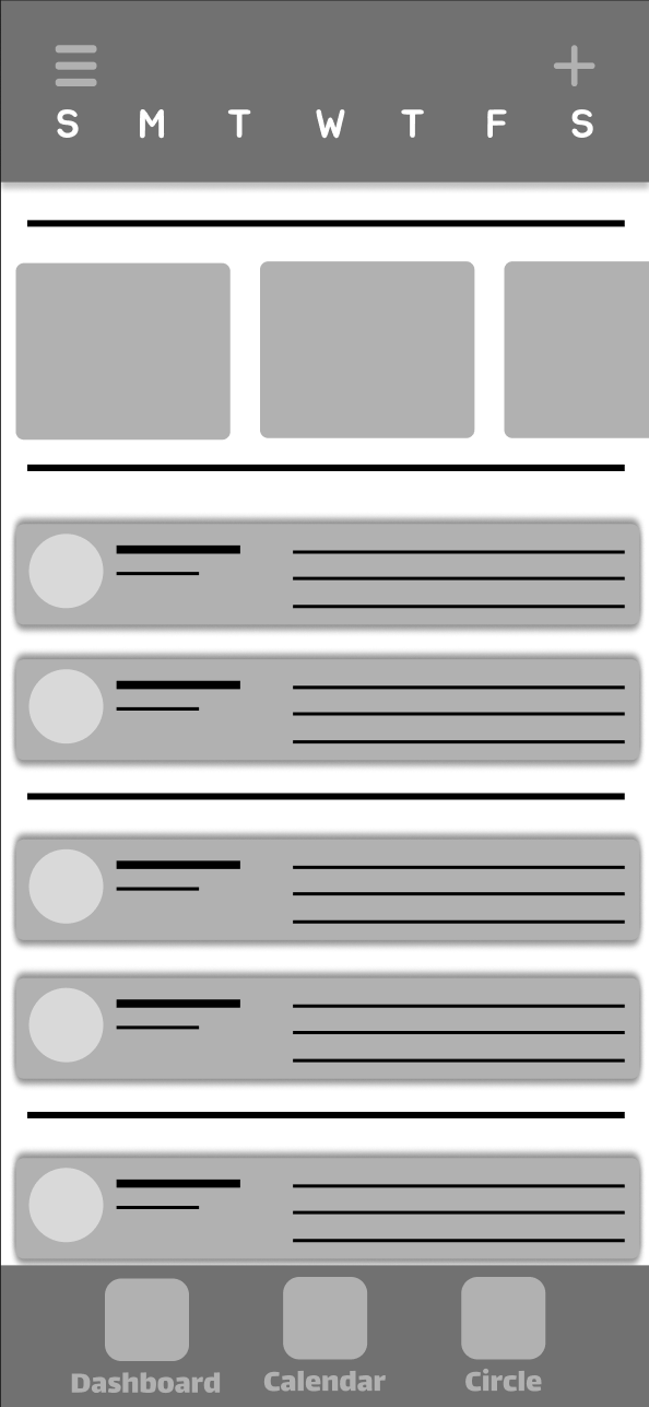
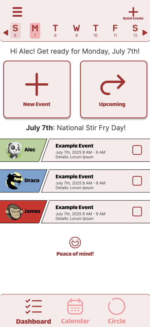
The mobile transition was where I really had to address the friction found in my early research. Since every single tester struggled to find the "New Event" feature in the low-fidelity version, I knew the mobile homepage needed a complete overhaul of its visual hierarchy. I moved away from the idea of a restricted dashboard and instead created a more open, hybrid experience that blends the dashboard and calendar into one view. The ‘homepage’ being just a dashboard made some users feel stuck instantly.
This new layout gives users immediate access to their children’s schedules for that day while still providing the flexibility to toggle between the rest of the week from the navigation bar at the top of the screen. The users are also able to quickly go to the full calendar and full dashboard depending on what they need to see using the hamburger menu or the bottom navigation bar. To fix the navigation stumbles, I placed the two most critical actions in adding a new event and viewing the upcoming events page directly on this hybrid homepage as large, colorful buttons. This "impossible to miss" approach was a direct response to the insight that users need clear affordances when they are in a hurry. By combining bold iconography with a kid-friendly design system, I turned a skeletal, confusing wireframe into a high-fidelity experience that prioritizes speed and clarity for everyone in the family.
Low Fidelity vs High Fidelity - Mobile Version
Project Overview
My Role: Designer, Researcher, Prototyper, Manager.
I served as the designer, researcher, and project manager for this project. Since this was an independent course project, I carried the design process from start to finish. I conducted research, synthesized findings, generated concepts, created prototypes, and tested designs.
FamCal is a cross-platform scheduling solution designed to provide low effort coordination between parents and children. I choose this type of project because my own mom and dad constantly have to ask about my schedule. My research revealed that existing tools lacked the child friendly navigation required for younger users, leading to user confusion from the children on their platforms. I developed a unified design system across desktop and mobile, implementing a bold, kid-friendly interface with consistent iconography and high-contrast touch targets. By scaling the "impossible to miss" event creation flow across both platforms, I eliminated redundant steps and created a synchronized dashboard that reduces the mental load for the entire family.
Empathize & Define
Early Ideation & Prototyping
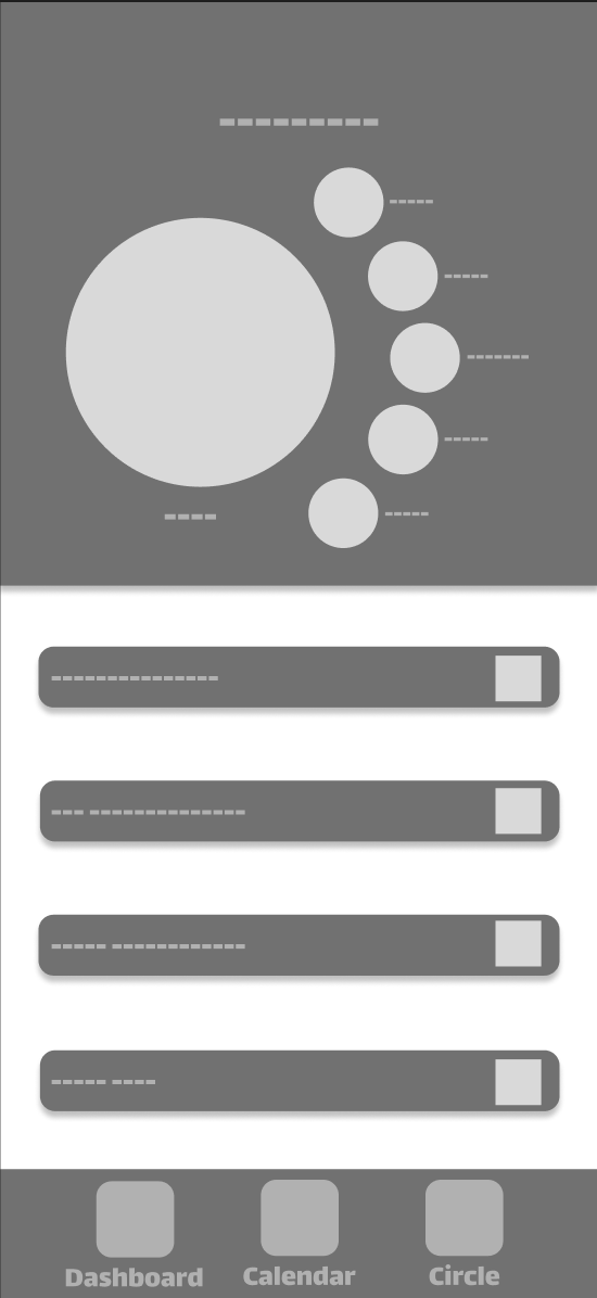
Sketching & Mapping - Mobile Version
I started the sketching process in a bottom-up design mindset by rapid prototyping across six different phone screen frames to explore as many layout ideas as possible. This was my chance to be messy and just figure out how the calendar and dashboard and ‘Circle’ could actually live together on one screen. Once I had a solid direction, I built out a sitemap to ensure the navigation felt logical. I eventually honed in on a design that felt the most intuitive for a family dynamic and moved those sketches into Figma. Transforming those paper ideas into a digital low-fidelity wireframe gave me a clearer look at the information architecture and helped me set the foundation for the interaction tests that followed.

Low Fidelity vs High Fidelity - Web Version

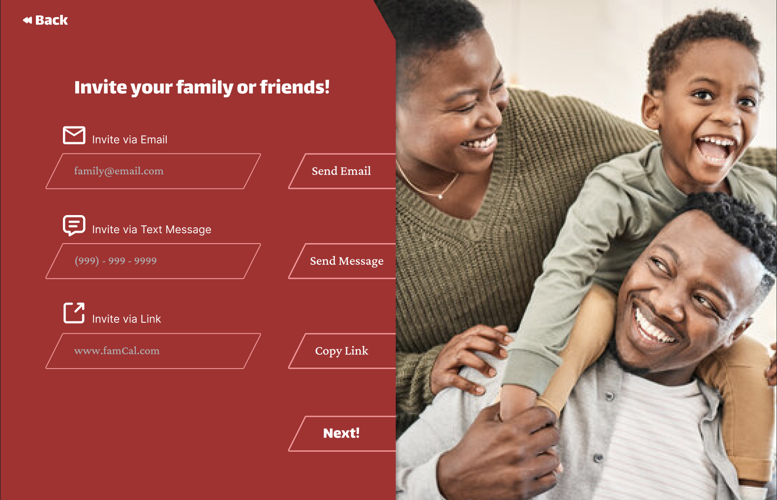


Addition: Messaging System
Missing Major Function: Messaging Other Users
One of the biggest features I overlooked was a messaging system for parents and children alike to keep each other up to date in real time without having to use a 3rd party messaging system. This was brought to my attention by a usability test round when a participant asked “Ok, I see my families tasks, how do I tell them to do it?” after this revelation I immediately added a messaging system.
Component Library
For the web version, I designed a sleek dark mode, contrasting with the clean light mode used for mobile. I maintained consistent typography and core colors across both to keep the brand recognizable, and made sure the colors contrast in accord with the WCAG guidelines. The dark interface gives the desktop version a more immersive, "command center" feel for parents managing the family schedule, while the playful light mode is more colorful and offers a favorable experience for their children and the next billion users who are more and more inclined to use sites and apps on their phones.
To make FamCal stand out against the sea of standard, boxy calendars, I set a personal design challenge to move away from traditional rectangles. I integrated unique trapezoid shapes into the navigation and event containers to give the interface a sharp, custom feel that you just don't see in typical corporate tools. While the design elements shift between screens to fit the desktop's scale and dark mode theme, this geometry acts as a visual anchor that makes the web version feel distinct. Beyond aesthetic reasons, this creates a recognizable brand identity that feels different from the rest.

Check out the full interactive prototypes. Feel free to leave comments!
Figma Link (Mobile Version): FamCal_Mobile
Figma Link (Web Version): FamCal_Website